2020 — Branding
Tribal, bold, fluid
background
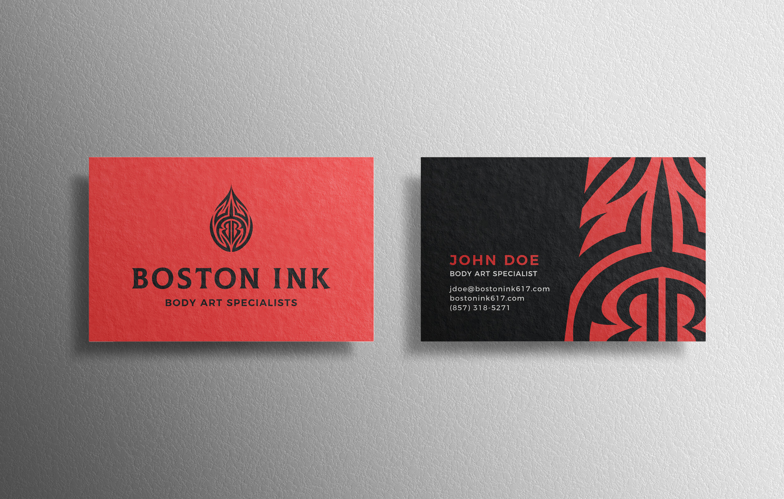
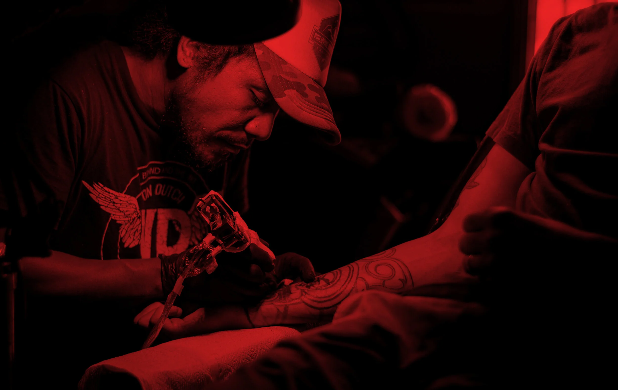
Boston Ink is a group of highly talented body art specialists offering tattoos and piercings. With this logo redesign, they wanted to come across as bold, professional, and creative. They loved the idea of presenting themselves as an empire and gravitated towards bold monograms with dual meanings. Initially, our visual inspiration consisted of royal imagery like crowns and crests, but as we discussed their vision, we moved more towards a tribal feel, drawing inspiration from tribal tattoos. We also introduced more fluid lines to represent ink and the fluid, collaborative nature of creativity and designing tattoos for diverse clients.
This project is ongoing with the next step being to develop their signage. This project is being completed under the creative direction of Lindsay Hill Design.